Triptych:
|
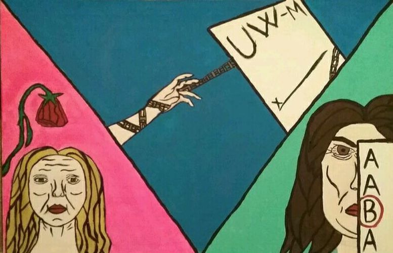
Nathing Is As Emportent As Yur Edukashun
Acrylic on Canvas 2 ft × 3 ft 02/02/17 |
Exhibition Text:
This piece really focuses on the pressure my parents put on me over my education. I wanted to demonstrate how this pressure affected my life and how I affect the environment around me due to the pressure. I chose to do pop art because I wanted the painting to be very pastel/bright to contrast the emotions and the sorrowful to the piece. I also chose pop art, specifically Warhol, because I wanted the picture to go from light to dark to explain the meaning.
Meaning:
The whole point of my piece is to demonstrate the pressure I feel from my parents about my education. Both my mother and father want me to get straight A's and be valedictorian. They want me to go to an excellent college and major in law or medicine. My mother planned the colleges I will apply for and everything. I want to go to college, but I want to major and go to the college of my choice. I wanted to encompass the emotions and stress I get. I have the feeling of being controlled, and I wanted to make a piece about that.
Artist Inspiration:
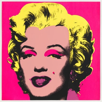
"Andy Warhol ." Untitled From Marilyn Monroe 1967 . MoMA, 2016. Web. 12 Jan. 2017. |
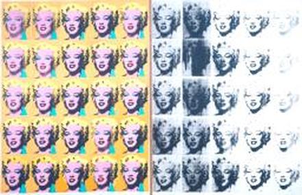
"Andy Warhol: Marilyn Diptych(1962)." Tate, n.d. Web. 19 Jan. 2017. <http://www.tate.org.uk/art/artworks/warhol-marilyn-diptych-t03093>. |
The artist I chose to take inspiration from is Andy Warhol. Andy Warhol was an American artist who a leading artist of the 1960's Pop Art movement. He was known to have "blurred" the lines of fine art and mainstream aesthetic. Andy Warhol was known for his avant-garde works, using rubber stamps to recreate the same image multiple times on the same piece. He was one of the most successful commercial artists of the 1950's. The piece I chose to emulate is The Marilyn Diptych, created in 1962. This piece was a silkscreen painting consisting of twenty different Marilyns, all the same picture. He changed the color of each Marilyn, making it look like he used a computer to change the contrast of each image. He went from bright colors to black and white to suggests of Marilyn's mortality. I decided to use Andy Warhol as my artist inspiration because I liked the message he was able to convey with the use of color and how it faded over time. I wanted to use the color scheme he used to suggest the meaning I wanted to convey in my piece. I also liked how each picture was brightly outlined in black, something I wanted to incorporate in my tryptic.
Journal: Planning, Process and Technique
Planning: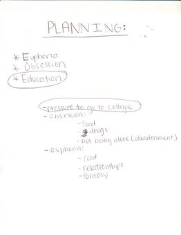
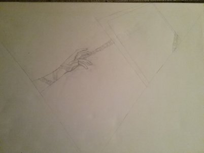
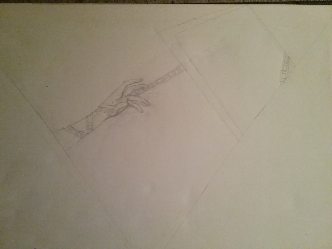
Sketches: |
I went through many ideas whilst making my tryptic. I originally was going to focus on obsession of some sort. I also thought about euphoria. I finally decided on doing the pressure of education because it was something I really wanted to show to the world. Society, in general, puts a lot of pressure on going to college. Society really values money instead of creativity and individuality. I wanted to explore that topic with my piece.
|
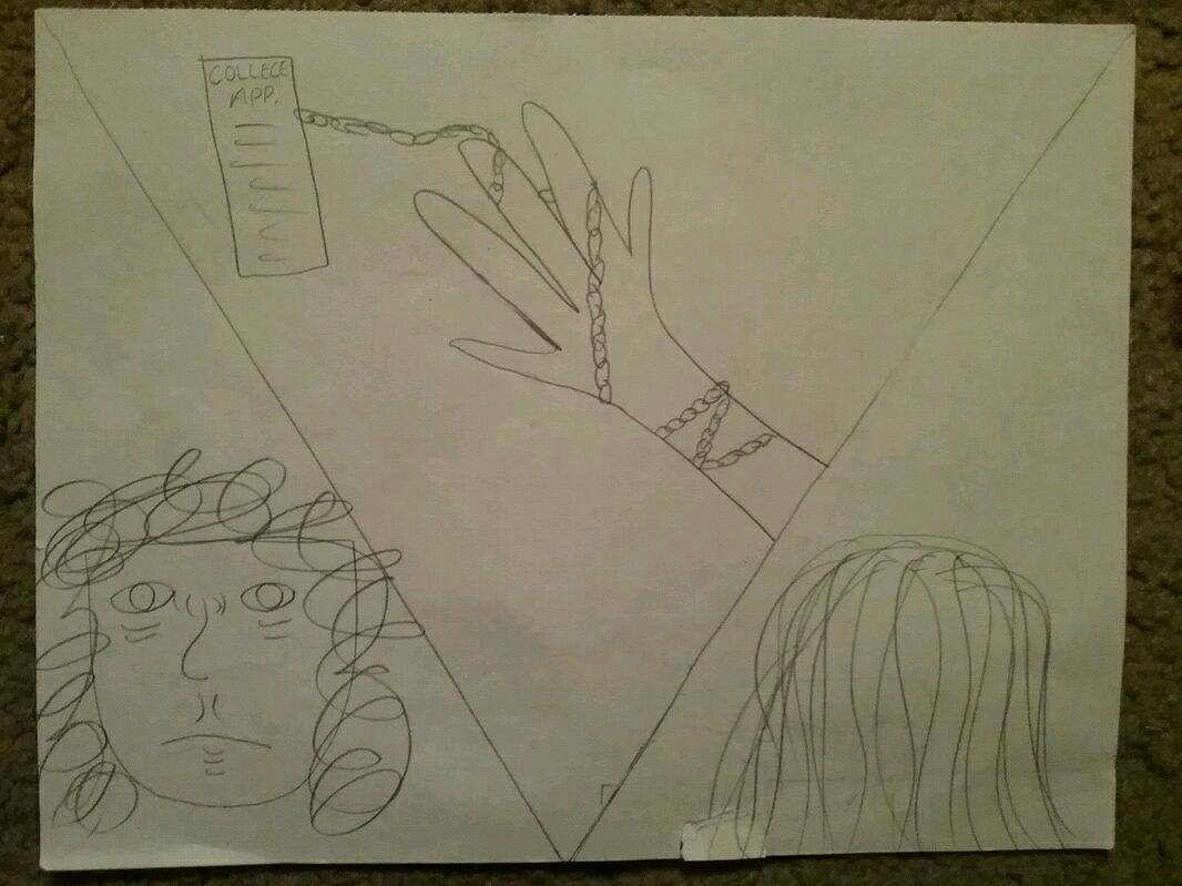
Each sketch explores the same theme: pressure of education. For the Who I am, i drew myself as an old person. The reasoning behind this is that I feel older than what I am. For the How I Affect My Environment, I drew my mother angry at me for a "bad" grade, since that happens ocassionaly. For How The Enironment Affects Me, I drew my hand being cuffed to a UW-M letter with a sign here marker. This is because I feel as if I am selling myself away at my mothers will.
This sketch explores a triangular design. I wanted to cut the board into three pieces,but decided to do it in triangles. I liked the way the piece looked. It looked very geometric and it reminded me of a comic book cut, which was very pop art-ish to me. The order of the parts were: Small triangle on the left: Who I am
Triangle in the middle: How my environment affects me Small triangle on the right: How I affect my environment |
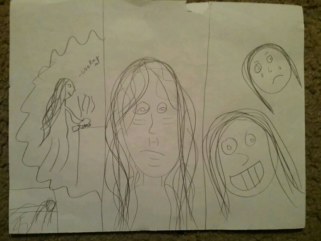
This second sketch is cut into three pieces. The cuts are vertical and each rectangle is the same size. I chose not to do this cut because it didn't scream "Pop Art" to me. The order of the components are:
Left: Who I am Middle: How the environment affects me Right: How I affect the environment |
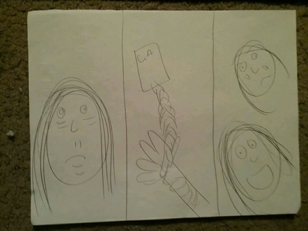
This last sketch is the same concept as sketch two, but the order of the pieces are different. I decided that the middle rectangle would be the "Who I Am" component.
|
Experimentation:
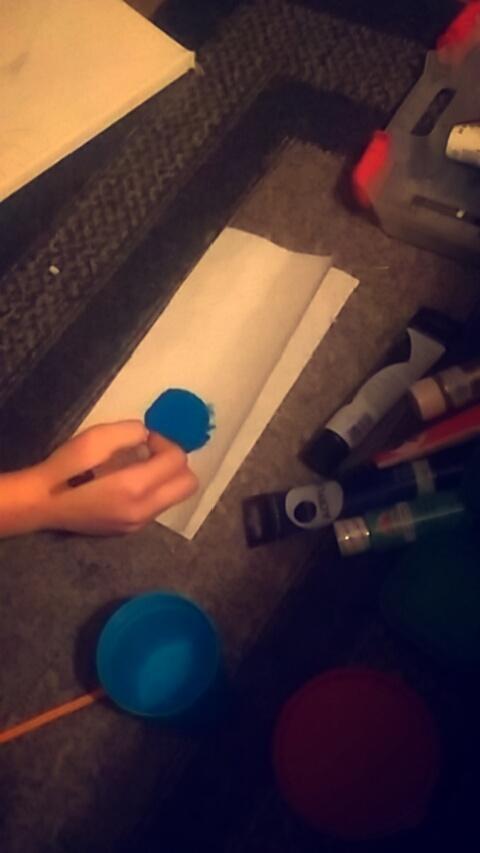
This is me mixing paints. I wanted blue color for the background. I added white and blue together to create this bright blue shown here.
|
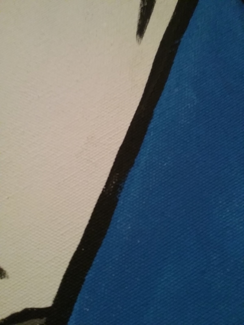
Here I experimented with dark, large lines. I liked this look for the hair and outlines of the paper. One setback was that I did this on the canvas, so I took a huge risk in doing this.
|
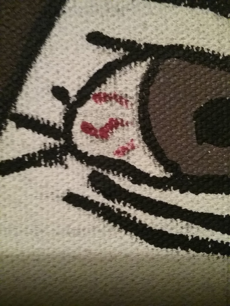
This last part is me experimenting with shallow, narrow lines. I quite liked this look for the eyes and chains.
|
Actual Process/Tools used:
Canvas w/ gesso
|
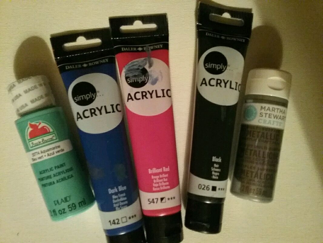
Paint
|
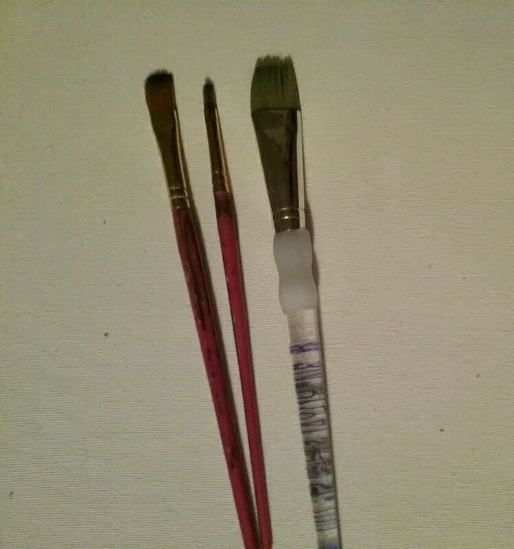
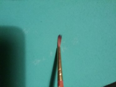
Paintbrushes
|
Process:
This part of the process is making the canvas as well as gessoing it. This part of the process was by far the easiest because iv'e done it multiple times.
|
|
This first part of my process is making a canvas. We are required to stretch our own canvas. You have to make the frame, staple it, cut out canvas, then staple the canvas onto the frame, and lastly cut off excess.
|
This next part is me drawing on my canvas. All my pieces were completed hand-drawn since it was easier and more quick. This also allowed me to alter things as I wished.
|
This last part is me painting. I put my colors into the forms then traced everything in black. It gave it a very 1950's comic book look.
|
Compare/Contrast:

"Andy Warhol ." Untitled From Marilyn Monroe 1967 . MoMA, 2016. Web. 12 Jan. 2017 |
Warhol and my piece ate similar in many ways. We both used Pop Art as a central movement. I, chose a more darker meaning than Warhol. Warhol and I both used bright colors. I worked with bright pink and blues, like Warhol. I had some darker tones, though. Our pieces are similar in the fact we both used dark lines to outline our pieces. I personally believe this gives it a comic book feel, which I love.Our pieces differ in the fact his looked more computer-esque. My piece was more comic book- looking, but it still looked nice.
|
|
Reflection:
My piece, overall, I believe was well done. I think that the painting is neat and clean, only a few edges being a bit thicker. I think that my message was conveyed well, especially with my mother holding the report card, an angry look since I got a B. I also decided to add a wilting flower to represent my feeling of old age. But, it also doubled on life going by quickly and that there are more important things than education. I also drew my hand reaching out towards the college letter, not because I want to go, but because I do desire to do what my mother wants and to make her proud. I also do want to go to college, but not a UW. I think a failure was the limit of colors. I kept my colors similar to Warhol's in the way they were bright. It also provided a nice contrast against the dark meaning of the piece. One problem I faced was making the lines totally straight. I did not have paint tape, so I did it free hand. This made some of the lines thicker, but that ended up working for me in the end. It looked nice thicker around the edges of the paper and thinner around the eyes. Another problem that I faced was getting a thick enough first coat. Some of the colors were very opaque, so they required multiple coats. If I did multiple coats of all the colors, I wouldn't actually be able to finish my piece. But, it all worked out in the end and the only piece that needed a second coat was the hot pink portion. All in all, I am proud of my piece.
ACT Questions:
1) Since Warhol made his colors very vibrant, I made my colors vibrant. Warhol outlined his piece with black lines, which lead to me outlining my piece with black lines.
2) Warhol believed that creativity and choosing your own path was very important to who someone was. He believed that individuality is very important.
3) I made the generalization that art is very influenced by your surroundings and the media. Warhol demonstrated that by making pieces of famous people.
4) The central theme was Pop Art. I also focused on education and the pressure it has put on me from my parents, as well as society.
5) A conclusion I made was that education is important, but it should be fun and you should focus your education around your interests.
